library(igraph)
library(ADAPTSNA)
library(visNetwork)
library(tidyverse)
library(threejs)16 Visualising Two Mode Networks
There are some additional considerations to network visualisation when you are working with two mode network data. Remember, you want to ensure your readers can effectively look to your network and clearly interpret the story that you are trying to tell. So far we have focussed on visual cues associated with way you layout the network, the colours of the nodes and size/thickness of nodes and edges and how these all help to execute this. One important consideration with two mode network data, however, is doing the same thing but while ensuring you audience understand which mode the nodes are. Here, then, let’s go through some basic and efficient ways to visualise two mode network data. Then, we will create a few more advanced visualisations as well.
To go through two mode network visualisation, we are going to use the Harry Potter two mode network data that you should be pretty familiar with by now. For this case, we are loading in the edgelist version of those data. This is on purpose so that it is a little easier to identify the individuals and groups from the data when we get to more complex visuals. More on that later.
As usual, we are using the ADAPTSNA package to load the data and then igraph’s graph_from_data_frame() function to make it into a network. Remember, when dealing with two mode data stored as an edgelist, we need to tell R to recognise the two modes. We do so with the bipartite_mapping() function.
hp_tm_edgelist <- load_data("Harry Potter_Two_Mode_Edge.csv")

hp_tm_net <- graph_from_data_frame(hp_tm_edgelist, directed = FALSE)

V(hp_tm_net)$type <- bipartite_mapping(hp_tm_net)$type
Now the data are in as we expect and are setup as a two mode network ready to run some visualisations!
Basic Two Mode Network Visualisation
Really, you have one main goal in visualising two mode netwrks and that is to make sure the audience understand clearly the separation of one type of node from the other. One way you can achieve this is to present groups in one colour and individuals in another.
In this visualisation, we use the vertex.color option in igraph’s plot() function and set the colour of the nodes equal to the vertex attribute of our object that is called ‘type.’ This characteristic includes a logical separate if the node is an individual (stored as FALSE) or a group (stored as TRUE). In the background, R stores these as 0/1. By setting the vertex colour equal to that characteristic, then, you effectively tell R to set the colour of individuals = 0 (no colour, or white) and groups = 1 (R stores as orange). So, our visualisation presents a clear separation between the node types. I augment this with a subtitle explaining that orange nodes are groups and white nodes are individuals.
par(mar =c(5,0,3,0))
set.seed(123)
plot(hp_tm_net,
     vertex.color=V(hp_tm_net)$type,
     vertex.label = NA,
     main = "Harry Potter Network", sub = "Orange = Groups, White = Individuals")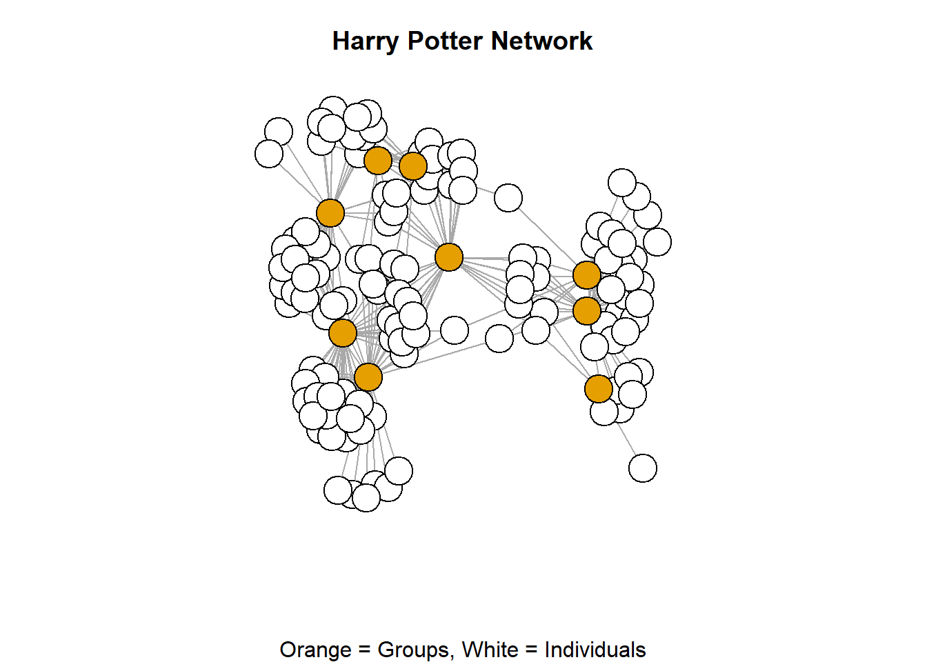
We could, go a little further in our basic visualisation of two mode networks. The nature of these types of networks are such that there tends to be more individuals than groups. As such, groups are, more often than not, more of a focal point for these types of visualsiations. So, in your visualisation, you might consider doing a little more to highlight the groups. Follow the logic in the code below and see what difference it makes in the visualisation it produces.
par(mar =c(5,0,3,0))
set.seed(123)
plot(hp_tm_net,
     vertex.size = ifelse(V(hp_tm_net)$type == "TRUE", 10,4),
     vertex.label = ifelse(V(hp_tm_net)$type == "TRUE", V(hp_tm_net)$name,""),
     vertex.label.cex = 0.25, vertex.color=V(hp_tm_net)$type,
     main = "Harry Potter Network",
     sub = "Orange = Groups, White = Individuals")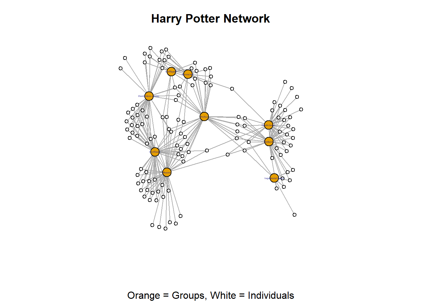
In the above viualisation we used an infelse statement to set the size of the groups larger than the individuals and another to show toggle off the labels of the individuals. These are basic coding techniques that generate effective visualisations of two mode network data.
There is one final element of your network that you can play with to really emphasise the two mode nature of your data and that is the layout. Previously, we have seen the way that layouts (either patterned or force directed) can emphasise different aspects of your data. Rings emphasise the edges while grids emphasise popular nodes a little more. When visualising two mode networks, you can use the layout_as_bipartite option to repel the node types away from each other. This places groups on one side and individuals on the other.
par(mar =c(5,0,3,0))
plot(hp_tm_net,
     vertex.color=V(hp_tm_net)$type,
     vertex.label = NA,
     main = "Harry Potter Network",
     sub = "Orange = Groups, White = Individuals",
     layout = layout_as_bipartite(hp_tm_net))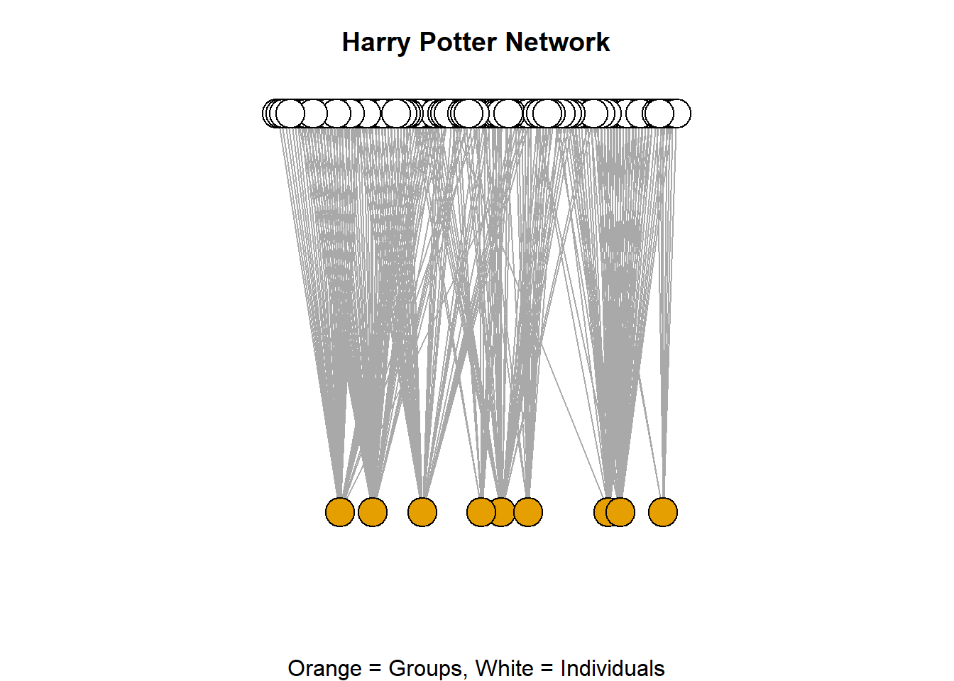
Intermediate Two Mode Network Visualisation
There are yet a few more complicated elements to making two mode network visualisation effective. These require a little bit more code and a little bit more knowledge of the inner workings of the R language. Here, we build a visualisation step-by-step and focus not only on the colours of the nodes as the big separator between the two types, but also introduce shapes. We want to end up with a clean visualisation where the groups are in one colour and have one shape and the individuals in another colour and a different shape. Doing this maximises the audiences comprehension between the two styles. It also ensures that your visualisation is accessible to colourblind audiences. This, although seemingly simple task, involves a bit or preparation work.
First, we need to set the parameters of the shapes and the colours (you can customise this part to your liking). In this chunk below we create two vectors with a character length of 2. This means that these data objects (shapes and colors) house two words separate from each other. The shapes vector has circle and square while the colors vector has green and orange. THIS NEXT BIT IS IMPORTANT. R stores these characters in an index (an ordering format) where the first vector is stored at position 1 and the second is at position 2 of the vector (we will come back to this). Once we have these two vectors, we can then use them to setup the parameters of our visualisation.
shapes <- c("circle", "square")
colors <-c("green", "orange")par(mar =c(5,0,2,0))
set.seed(123)
plot(hp_tm_net,
vertex.color=colors[V(hp_tm_net)$type+1],
vertex.shape=shapes[V(hp_tm_net)$type+1],
vertex.label = ifelse(V(hp_tm_net)$type == "TRUE", V(hp_tm_net)$name,""),
vertex.label.cex = 0.5,, vertex.size = 7,
main = "Harry Potter", sub = "Characters Connected to Groups")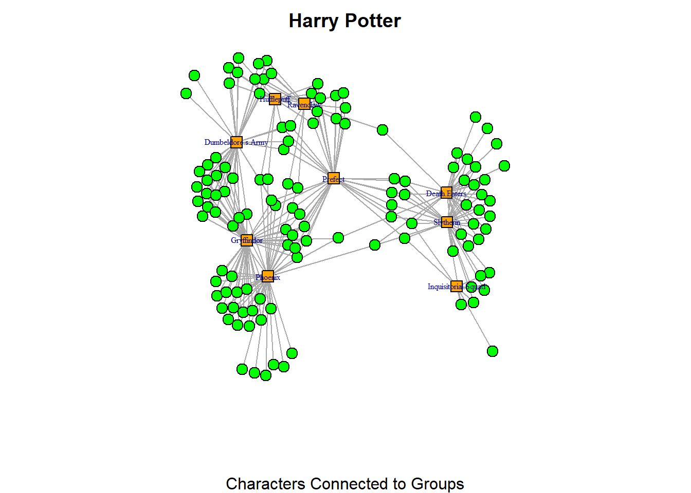
Here, I tell R to use the indices I’ve defined in the shapes and colors vectors and apply those to the network using the vertex.shape and vertex.color arguments. Notice that I need to state type + 1 in both of these arguments. It might look a bit unusual at first, but it makes sense once we take a closer look at what R does behind the scenes.
The “type” vertex characteristic is stored as TRUE or FALSE. You can verify this by running the code V(hp_tm_net)$type. This will display a long list of TRUE and FALSE values which are stored in R as logical values: TRUE is equivalent to 1, and FALSE is equivalent to 0. Meanwhile, remember that the characters for our shapes and colors vectors are indexed differently. R always starts indexing at 1. In our colors vector, “green” is stored at index 1 and “orange” at index 2. For the shapes vector, “circle” is stored at index 1 and “square” at index 2. Thus, there’s a mismatch between how the “type” characteristic is stored (as 1/0) and the way the shapes and colors vectors are indexed (which start from 1). To fix this, we add +1 to the type values, so that FALSE (which is stored as 0) becomes 1, and TRUE (which is stored as 1) becomes 2. By doing this, we match those with type = TRUE (groups) with the orange squares, and those with type = FALSE (individuals) as green circles. Remember that in two mode networks, the second mode (which represents the “groups” in the bipartite network) is always considered to be the “TRUE” type.
So, now we understand the code, we can take a look at the visualisaiton. We see that the new visualisation was a lot clearer than the first! Adding the colours and the shapes to a specific, high-contrast pairing makes the distinction between the two types of node in the network very clear and accessible to multiple audiences. Be aware of the accessibility of your parameters by choosing shapes that are clearly distinguishable from one another (maybe not sphere and circle, or square and rectangle) and colours that are very distinct (avoid common colourblind pairings like red and green, for example).
One final thing that we can do to maxiimise the accessibility of two mode network visuals is add a legend to the visualisation to further explain the network. You have to be mindful that some people may not see colours too well. So, differentiating the colours might not be so useful. Adding the legend on the plot can help orient people a little more to the visualisation you are presenting. Here we repeat the code from above to reproduce the plot. Then, you can use the legend() function to further explain the plot.
par(mar =c(5,1,2,1))
set.seed(123)
plot(hp_tm_net,
     vertex.color=colors[V(hp_tm_net)$type+1],
     vertex.shape=shapes[V(hp_tm_net)$type+1],
     vertex.label = ifelse(V(hp_tm_net)$type == "TRUE", V(hp_tm_net)$name,""),
     vertex.label.cex = 0.5, vertex.size = 7,
     main = "Harry Potter", sub = "Characters Connected to Groups")

legend("bottomleft",
       legend = c("Characters (circle)", "Groups (square)"),
       fill = c("green", "orange"),
       title = "Node Types")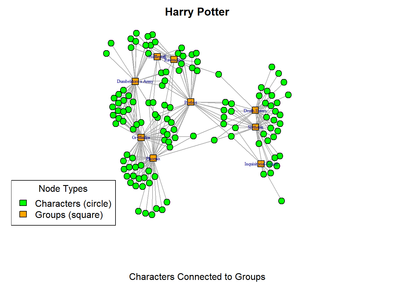
Advanced Two Mode Visualisation
You might be interested in creating interactive network visualisations with your two mode network data. This is absolutely possible and just requires a little bit more work to make them useful. As with any visualisation of these data, it is important to make the types of node explicit. We can use the same principles of visualisation (shapes, colours, legends etc). Keep your eye on this process as we create two interactive networks.
First, we will create a a two dimensional visualisation using the visnetwork package. This requires a little bit of preparation of the data. For this visualisation to work, you need to have two dataset. One of them has the information about the connections (the object that I call “d_done”). Note that the column names must be called “To” and “From.” The second one must have information about the nodes (the object I ca;; “nodes_done). Since you are experienced with similar processes, see if you can follow the logic of the code chunks below.
Let’s start with the information about the nodes. This chunk pulls the names for the groups and characters into separate string vectors that we need later on. Note, this is why we brought the data in as an edgelist because the process is much simpler to pull the unique names of the characters and the groups from the two separate columns of the data frame structured like an edgelist. There are many ways you could end up with the same information (like pulling the names from the network object by their type), but this is the cleanest and least code heavy approach.
groups <- unique(hp_tm_edgelist$group)
character <- unique(hp_tm_edgelist$character)
With the “groups” and “character” vectors, we can now create one data frame with all the information we will need for the visualisation. The chunk below creates two data frames (one or groups and the other for characters) which we then merge together using the rbind() function into the nodes_done object.
nodes <- data.frame(
  id = groups,
  label = groups,
  group = "groups",
  color = "orange"
)

nodes2 <- data.frame(
  id = character,
  label = "",
  group = "character",
  color = "lightgreen"
)

nodes_done <- rbind(nodes, nodes2)
The last step in the data preparation is to change the labels of the columns of our edge list which we can do using the chunk below. This is done because the visNetworkpackage does not recognise a table as network unless the edgelist has those titles.
d_done <- hp_tm_edgelist %>%
  rename(from = character,to = group)
Now we can visualise our nifty network using the visNetwork() command, this chunk creates a completely customisable two mode network visualisation. This visualisation you can click and drag nodes to place them where you want (visPhysics set to FALSE). As you click on a node their neigbours are highlighted so you can see their connections (highlightNearest set to TRUE). Notice that only the names of the groups are showing? This is achieved when we created the nodes_done data frame where we set the label = ““. Then, in the visualisation, you can use the visNodes(font =) option. Finally, we add a legend using the visLegend() option. This chunk is quite overwhelming because there are many things going on here. I suggest looking at each function (left justified) and focus on understanding each section of code.
visNetwork(
    nodes_done,
    d_done,
    width = "100%",
    height = "800px",
    background = "white") %>%
  visIgraphLayout(layout = "layout_nicely") %>%
  visGroups(
    groupname = "character",
    shape = "dot") %>%
  visGroups(
    groupname = "groups",
    shape = "square") %>%
  visNodes(
    font = list(size = 30)) %>%
  visOptions(
    highlightNearest = TRUE,
    nodesIdSelection = FALSE) %>%
  visPhysics(
    enabled = FALSE) %>%
  visLegend(
    useGroups = FALSE,
    addNodes = list(
      list(
        label = "Characters",
        shape = "dot",
        color = "lightgreen",
        font = list(size = 10)),
      list(
        label = "Groups",
        shape = "square",
        color = "orange",
        font = list(size = 10))),
    width = 0.15,
    position = "right")
Alternatively, you may wish to create the 3D version of the two mode network.
Hover to see the label of the nodes (both types).
V(hp_tm_net)$shape <- ifelse(V(hp_tm_net)$type == TRUE, "square", "circle")
V(hp_tm_net)$color <- ifelse(V(hp_tm_net)$type == TRUE, "orange", "green")

hp_tm_3d <- graphjs(hp_tm_net,
  vertex.size = 0.5,
  vertex.label = V(hp_tm_net)$name
)

hp_tm_3d
Summary
To summarise, when working with two mode network data, you need to find ways to communicate clearly the distinctions between the nodes in your visualisations. Remember, thee data are quite complicated and viewers can get lost in the details. In this section, we have covered basic approaches to avoiding this by toggling colours, sizes and labels. These efforts serve to create contrast between the two types of node and draw the viewers’ attention where you want it to be. We have also added more layers to this by changing the shapes of nodes and introducing a legend to your visualisation. I strongly reccomend that you engage fully with these practices - I know they are a bit more work computationally. The payoff in your visualisation is such that you make sure that the attention of your audience is where it needs to be. Finally, we have applied these principles of clarity and accessibility to more advanced visualisations enabling you to create some fun interactive network visuals with your two mode network data.